
SINIOR Coffee Shop
The SINIOR | Coffee Shop brand identity is a refined and contemporary Wordmark that masterfully balances classic typography with modern, minimalist principles to communicate maturity, quality, and a premium coffee experience. The logo centers on the name “SINIOR,” which is rendered in an elegant, customized All-Caps Serif font that features high contrast between thick and thin strokes, immediately evoking a sophisticated, established, and luxury aesthetic often seen in high-end European branding. This stately wordmark is cleanly paired with the secondary descriptor “Coffee Shop” using a simple, modern Sans-Serif font, which grounds the brand in its contemporary retail function and creates a deliberate visual contrast with the formal main name. The entire design uses a stark, classic color palette (Black/Dark Gray on white or cream) to ensure high legibility and timeless appeal, positioning SINIOR as a dependable and exclusive destination for quality coffee.

COZE
The COZE brand identity is a masterclass in modern, maximalist streetwear branding, intentionally operating with multiple logotypes and typographic styles to maintain a versatile, fluid, and disruptive image. The brand successfully bridges high-end luxury aesthetics with casual street attitude. The core color palette is starkly minimalist—predominantly Black and White—allowing the complex typography and iconography to command attention. COZE avoids a single static identity, instead treating its name as a mutable graphic element. This dynamic approach positions COZE as a fashion label that doesn’t follow a single rule, reinforcing the motto seen in the files: “YOUR WARDROBE. YOUR RULES.”
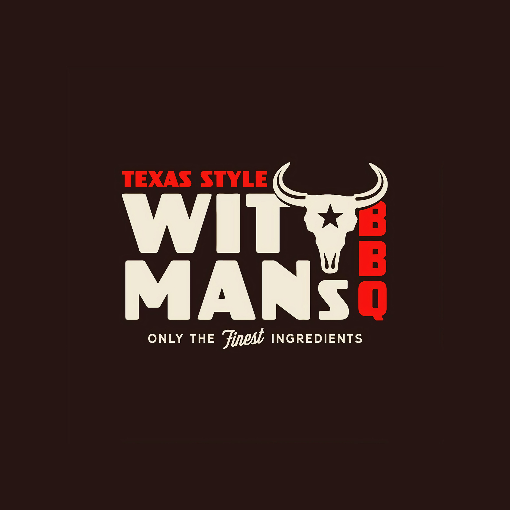
Witman’s BBQ
The WITMAN’S BAR-B-Q brand identity is a masterful example of a Heritage Emblem, using a meticulously designed circular badge to communicate authenticity, longevity, and a dedication to traditional Texas-style techniques. The entire system is built upon a classic, appetite-inducing color palette: deep brown/black for the heavy typography and the central Steer Skull icon, set against a warm cream background, which suggests both robust flavor and established history, while a vibrant red is strategically used for key accents like the star on the skull’s forehead and the “TEXAS STYLE” designation to inject energy and regional pride. By combining a heavy, arching Slab-Serif wordmark with iconic Western imagery and grounding it with the “Est. 2003” date, the logo immediately positions WITMAN’S as a trusted, high-quality, and authentic barbecue institution whose message is concisely summarized by its motto: “ALL SMOKE NO JOKE.”
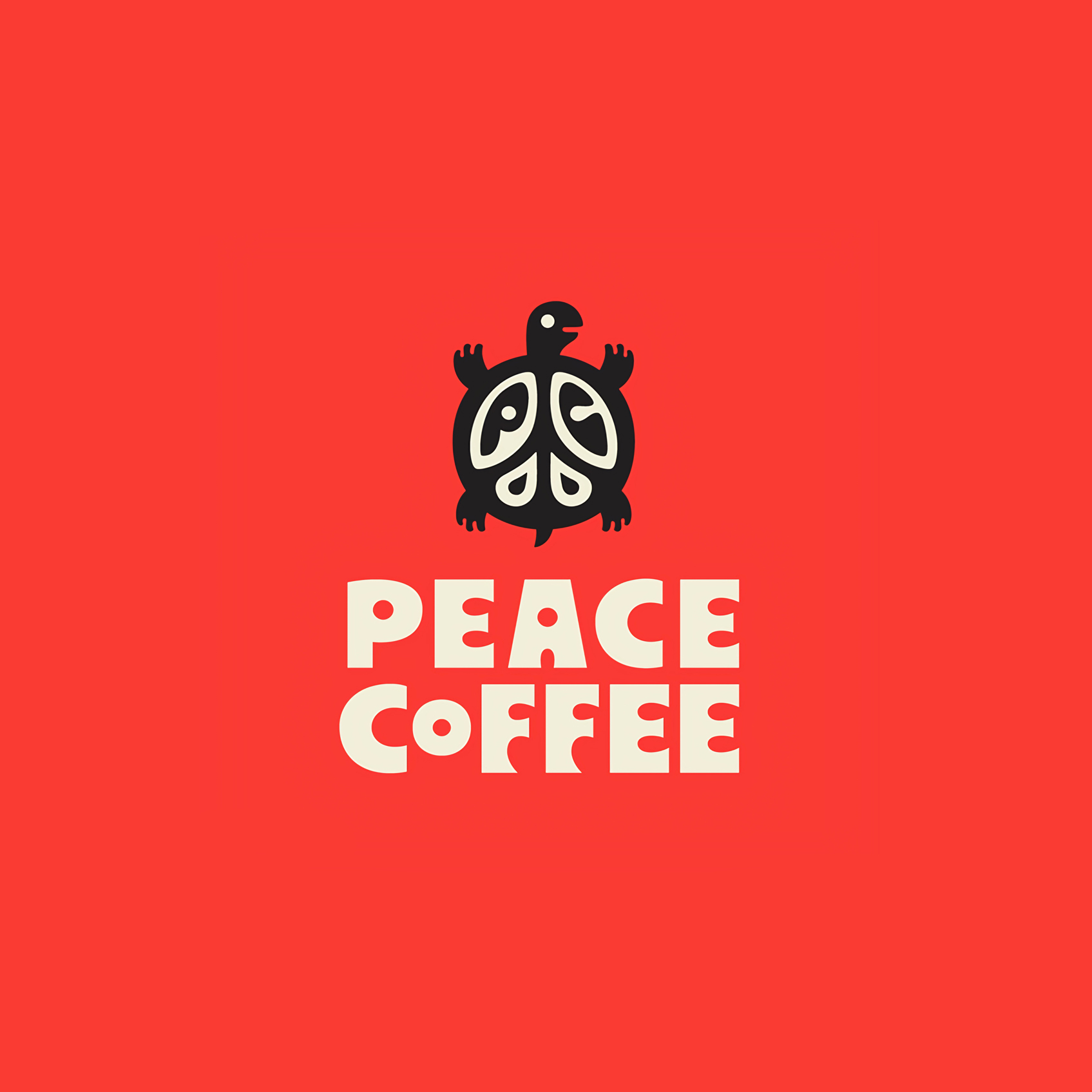
Peace Coffee
The PEACE COFFEE brand identity is a striking and memorable system designed to communicate its core values—peace, sustainability, and quality—through a bold, retro-inspired aesthetic. The entire design relies on high-impact simplicity and a strong commitment to its central message. The visual system uses a powerful, two-color palette: a warm, inviting Tomato Red (or Coral) dominates the background, serving as a vibrant, energetic base that suggests warmth and community. This is contrasted sharply with a thick, creamy Off-White/Cream for the typography, and a stark Black for the mascot’s silhouette. This palette is reminiscent of mid-20th-century advertising, giving the brand a feeling of instant nostalgia and reliability. The centerpiece is the unique Turtle Mascot, which cleverly integrates the iconic Peace Sign into its shell. This ingenious fusion makes the brand instantly recognizable, memorable, and visually reinforces its commitment to global or environmental peace.
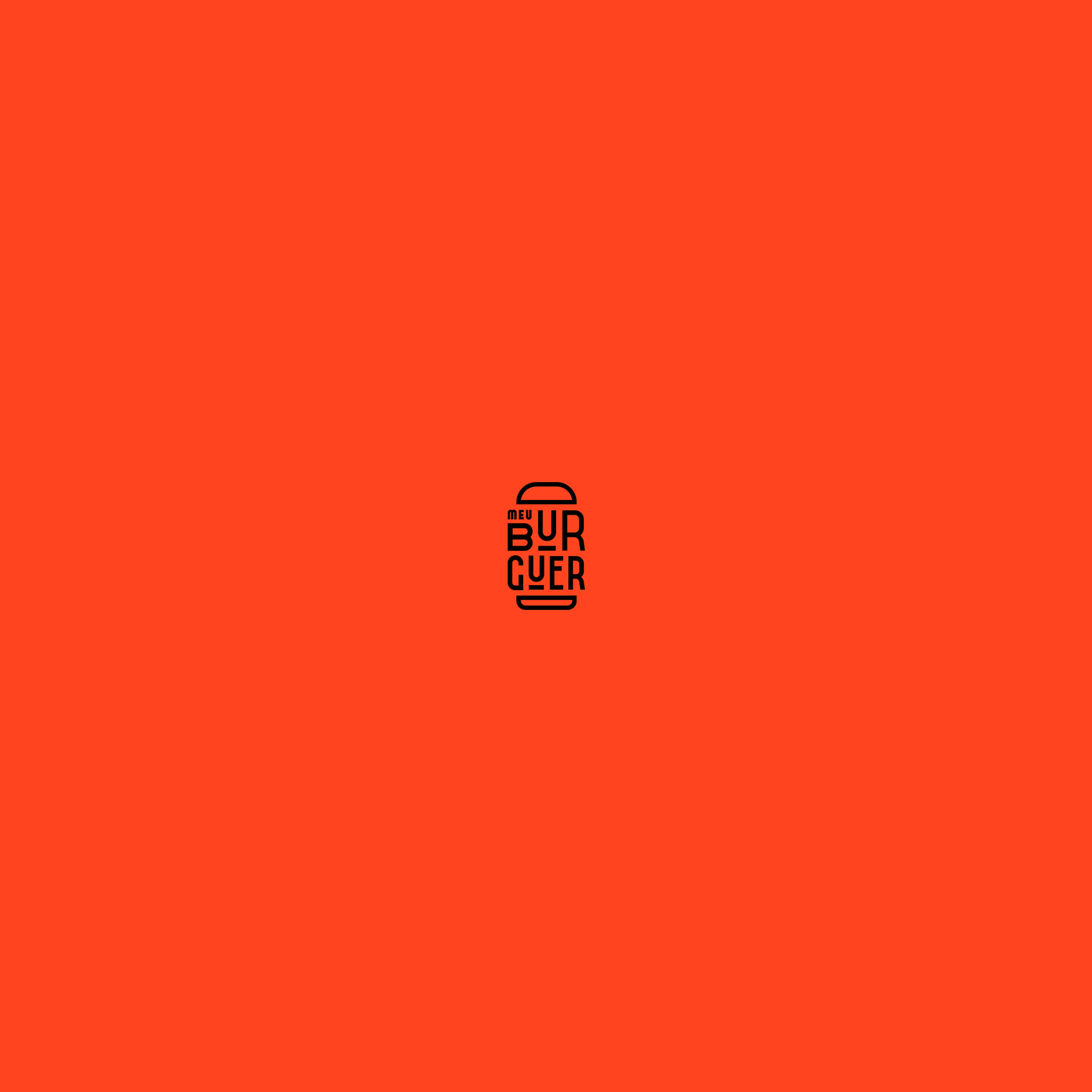
Meu Burger
The MEU BURGUER (My Burger) brand identity is an outstanding example of a visual pun and minimalist design, using a clever combination of typography and iconography to create an instantly recognizable and memorable mark. The entire logo is contained within a clean, single-line graphic that simultaneously reads as a hamburger and the brand’s name, achieving remarkable efficiency in communication. The primary aesthetic is sleek, modern, and high-contrast. The logo uses a dynamic, energetic Orange-Red or Burnt Orange against a stark black background, a choice that signifies appetite, quality, and a modern, premium fast-casual experience. The design’s success lies in its use of monoline geometry, where the wordmark is constructed solely from lines of uniform thickness, reinforcing the clean, precise, and contemporary nature of the brand. This entire system positions MEU BURGUER as a stylish, quality-focused burger concept that understands visual design.