The goal of a logo is to perfectly represent your brand to an audience, while also differentiating you from others out there. When someone looks at your logo they should be able to determine two things: if they desire the product and if they want to buy it from your company. The principles of logo design will help you do that.
Learning how to design a logo can seem overwhelming. Where do you begin? That’s where the logo rules below come in handy.
Logo design is a process that gets easier when you approach it with knowledge, experience and a solid plan. If you want to create something great it’s important to know the principles of graphic design and learn some graphic design basics. Then determine who your customer is and what it is that you want to tell them. Your logo design choices will make a big difference in helping you communicate your message to your customer.
The logo design principles below are the rules you need to follow if you want to create an effective and successful logo.
The 6 key principles of logo design to know about:
You want your logo to be as clear and visible as possible while reflecting your aesthetics and conveying your philosophy. Take the Nike logo—nothing more than a monochrome swoosh. It doesn’t get simpler than that.
Wise choices in typeface, color options and graphics are crucial to this step. Is your logo made up of several overlapping shadings, images, fonts, letters? Choose just a few active elements for your design—a good logo is not overcrowded with elements. And don’t forget the white space! Simplicity requires excellent use of spacing. The elements that make up your logo need to breathe so that your logo stands out and speaks clearly to your audience.
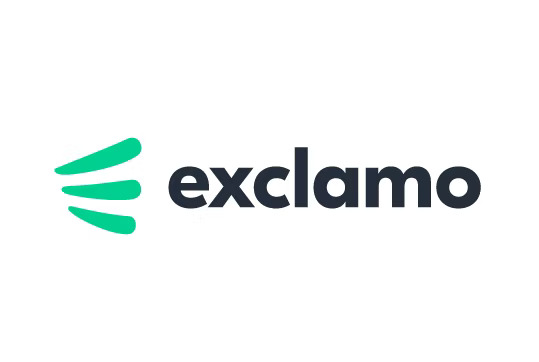
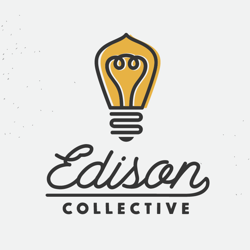
THE THREE LINES THAT MAKE OUT THE “E” MAKE THE LOGO SIMPLY EXPRESSIVE.
2. Originality
Your logo needs to be different enough to attract attention and memorable enough to remain in people’s minds.
Think of all the unforgettable logos stashed in your memory: Starbucks, UPS and Apple are at the top of the list. Maybe we remember them because we see them non-stop, but perhaps it’s also because they’re original and unforgettable. Successful logos stand out from the crowd by being different, original and memorable. Your logo must attract a first glance that people will remember and then express trust and reliability upon repeat interactions.
A unique logo design calls for a unique design concept. This is the point in logo design where artistry meets great ideas and a firm grasp of consumer design. A skilled graphic designer can respond to your logo goals, with all these considerations in mind and create something truly original.
3. Versatility
A pictorial mark (sometimes called brand mark or logo symbol) is an icon—or graphic-based logo. It’s probably the image that comes to mind when you think “logo”: the iconic Apple logo, the Twitter bird, the Target bullseye. Each of these companies’ logos is so emblematic, and each brand so established, that the mark alone is instantly recognizable. A true brand mark is only an image. Because of this, it can be a tricky logo type for new companies, or those without strong brand recognition, to use.
The biggest thing to consider when deciding to go with a pictorial mark is what image to choose. This is something that will stick with your company its entire existence. You need to think about the broader implications of the image you choose: do you want to play on your name (like John Deere does with their deer logo)? Or are you looking to create deeper meaning (think how the Snapchat ghost tells us what the product does)? Or do you want to evoke an emotion (as the World Wildlife foundation does with their stylized image of a panda—an adorable and endangered species)?
4. Scalability
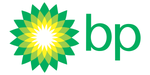
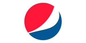
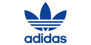
An abstract mark is a specific type of pictorial logo. Instead of being a recognizable image—like an apple or a bird—it’s an abstract geometric form that represents your business. A few famous examples include the BP starburst-y logo, the Pepsi divided circle and the strip-y Adidas flower. Like all logo symbols, abstract marks work really well because they condense your brand into a single image. However, instead of being restricted to a picture of something recognizable, abstract logos allow you to create something truly unique to represent your brand.
The benefit of an abstract mark is that you’re able to convey what your company does symbolically, without relying on the cultural implications of a specific image. Through color and form, you can attribute meaning and cultivate emotion around your brand. (As an example, think about how the Nike swoosh implies movement and freedom).
5. Balance & Proportion
Humans recognize balanced designs as beautiful. A well-proportioned design will strike a balance between the various elements that make up your logo.
Proportion refers to the weight of each of the elements that make up your logo. From a practical perspective, the right proportions will make your logo whole and help it to make sense.
Symmetrical logos are balanced through equally weighted elements aligned on either side of a center line. On the other hand, asymmetrical logos can be balanced too, using opposite weights to create a composition that is not even, but still has equilibrium.
6. Timelessness
A timeless logo looks just as good in ten year as it looks today. Avoid giving in to short-lived fads when designing your logo and go for a classic look. Psychedelic 70s-inspired logos might be all the rage for your industry today, but they might be played out in a year.
Epic logos stand the test of time because they pay attention to logo principles and rules that last, rather than what everyone else is doing right now.
As your company grows and changes, a logo that holds your fundamental goals and ideals will remain current. Something that may seem quirky or timely in the current cultural sphere might help your brand gain attention at the moment but it might lose that meaning in the future. Something that speaks to you and speaks for you will stay by your side for the duration.
One way to test out this logo design principle is imagining the following scenario: Think of yourself explaining the thought behind your logo over and over again for years to come. Would your explanation still feel valid 5 or 10 years from now?