Peace Coffee
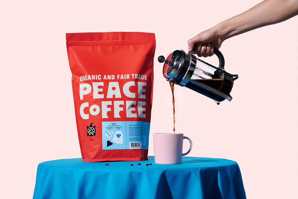
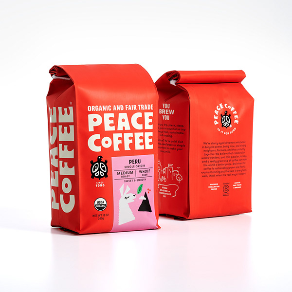
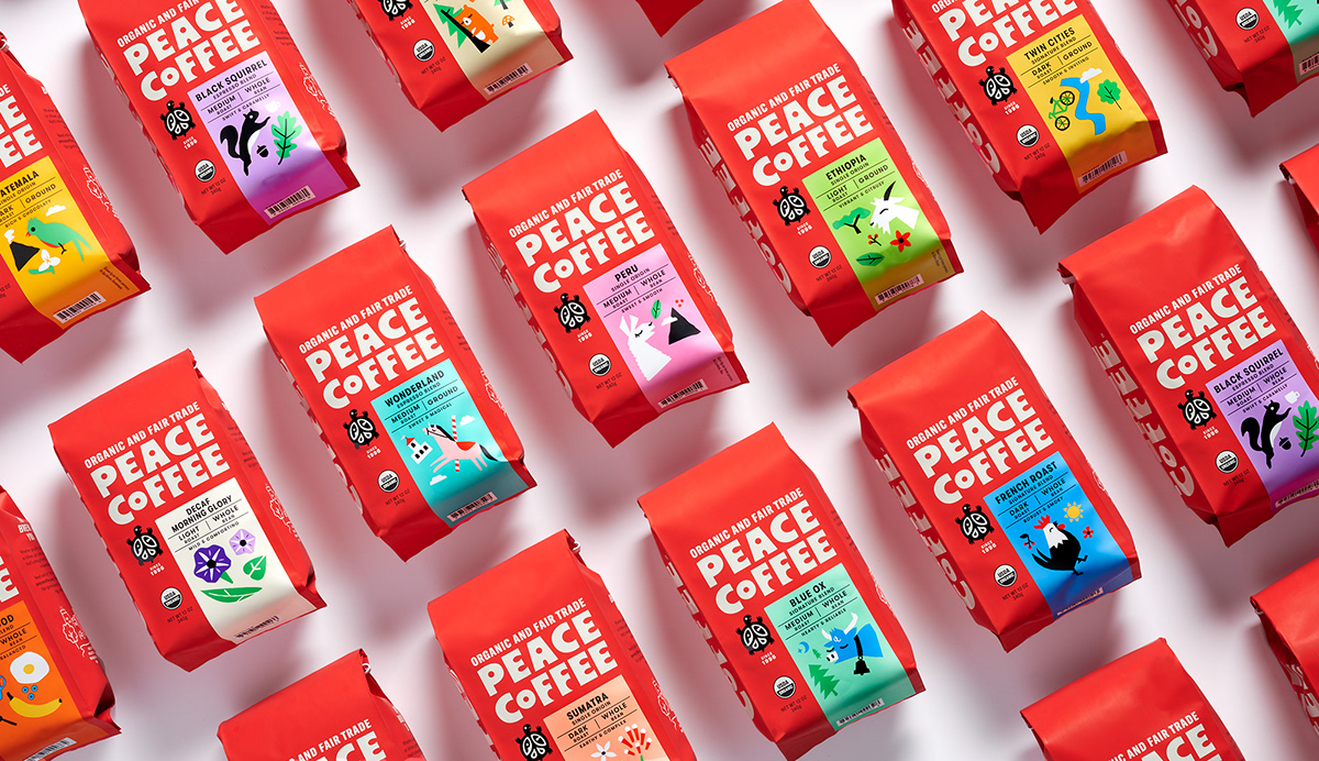
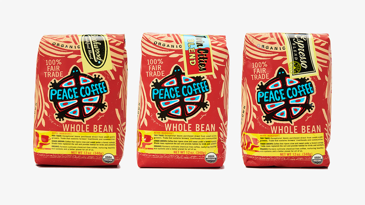
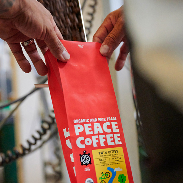
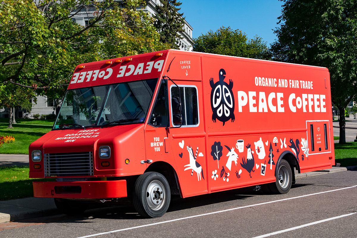
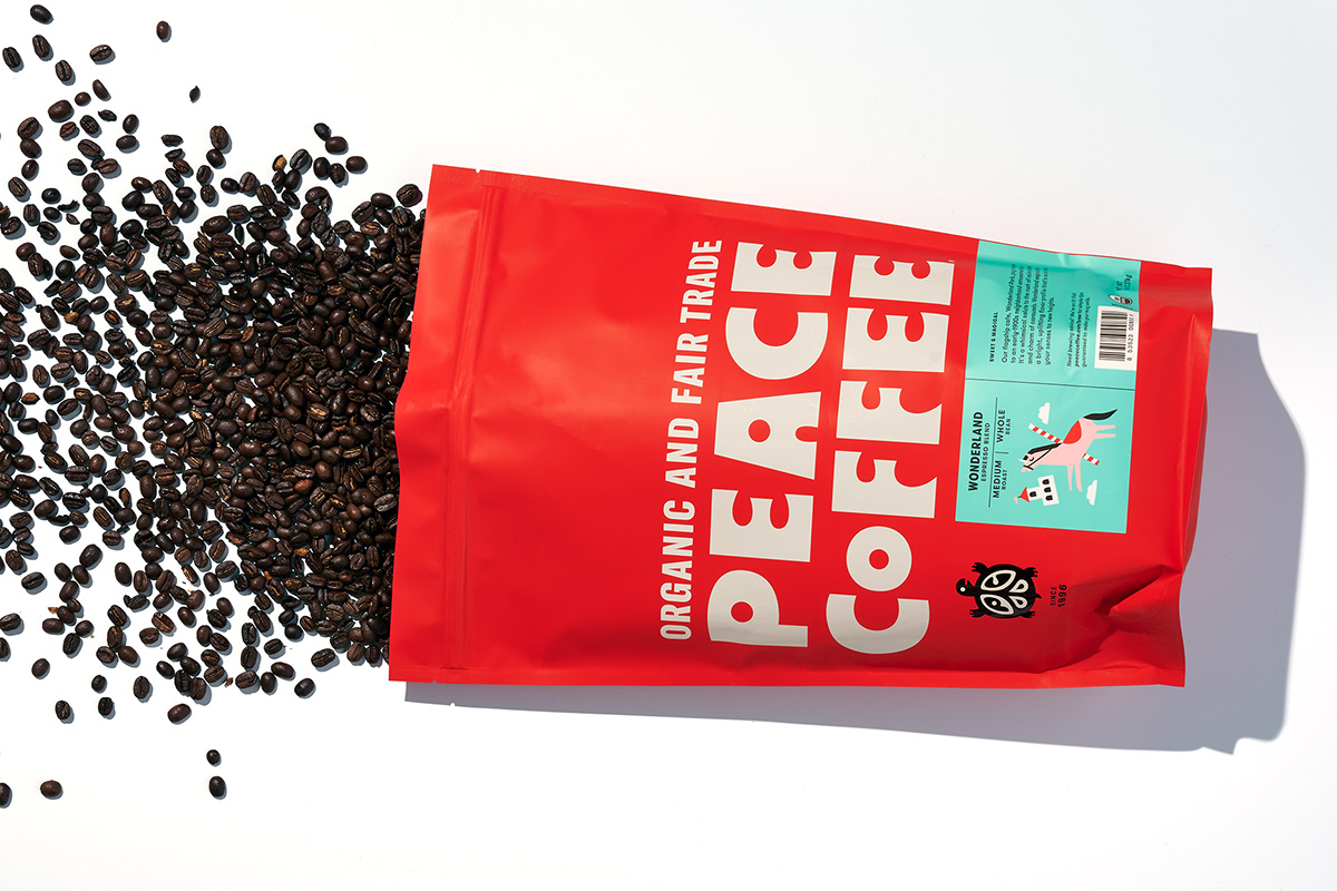
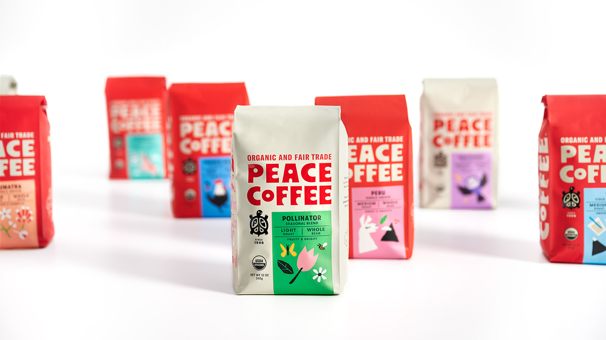
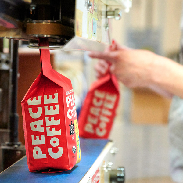
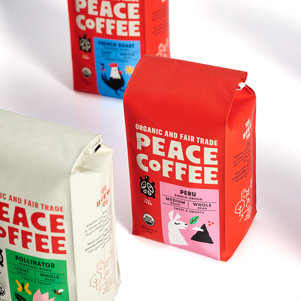
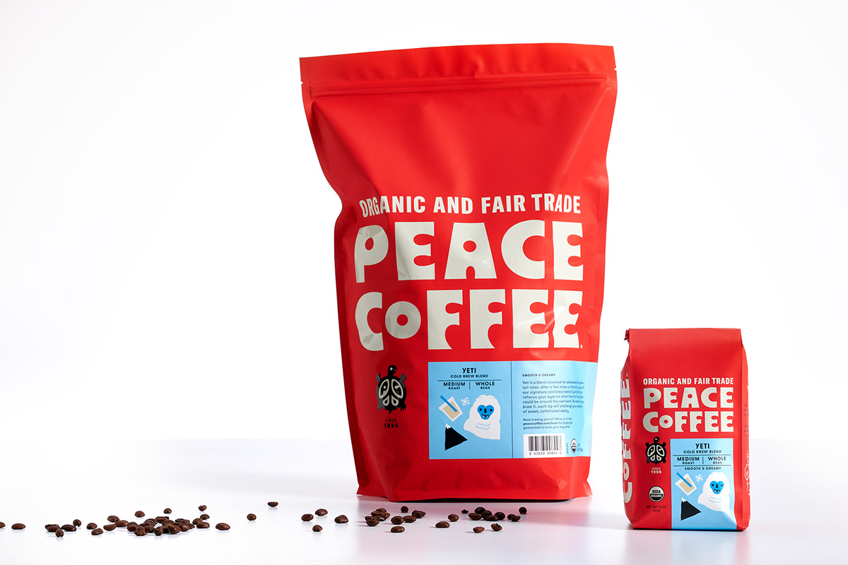
Peace Coffee’s brand identity is a testament to the harmony found in every sip. Our branding efforts for Peace Coffee have culminated in a visual language that reflects the values of sustainability, quality, and global consciousness. At the core of this identity is a thoughtfully crafted logo that encapsulates the serenity and global connectivity inherent in the brand. The color palette, consisting of rich reds, creamy tones, and classic black, is a blend that evokes a sense of warmth and sophistication. This combination not only reflects the commitment to ethical sourcing but also creates a visually striking and memorable aesthetic.
Typography is carefully selected to convey a balance of approachability and sophistication, mirroring the brand’s dedication to delivering a premium coffee experience. In summary, Peace Coffee’s brand identity is a harmonious blend of aesthetics and values. It not only invites customers to savor the rich flavors of the coffee but also to be part of a global movement towards conscientious and sustainable choices. Peace Coffee is not just a beverage; it’s a journey towards a more peaceful and connected world, and our branding efforts ensure that this journey is visually compelling and deeply resonant.

